
Jeremiah D Clark
Designer, writer, and producer from New
England, currently living in Atlanta. I'm
interested in technology, fountain pens,
cryptids, esoterica, and animal welfare.
Portfolio

2D & Vector Art

Game Art, UI, Design
3D Art
Blog
Projects
Tools & Utilities

Markdown → Medium
Documentation

Toki Pona Primer

Georgia COAM Documents


Web App Prototypes

Harmony Color Picker

Flexible Kanban Board

Spectral Sensitivity Chart
About Me
My Work
I'm a Creative and Technical Project Manager with more than 7 years shipping regulated, skill-based, and mobile gaming products—from the first concept meeting through certification and launch. I can sit with engineers, artists, compliance teams, and external partners, and actually follow what each of them needs. The result is faster delivery, fewer surprises, and less technical debt along the way.
Get in Touch
2D & Vector Art
Cryptid Legends Series
I've always loved cryptids. A few years ago, I created a series of vector art designs based on many of my favorites. Some of these are available as t-shirt designs on Amazon.com.


Logo Designs


Misc. Other Designs


Game Art, UI, & Designs
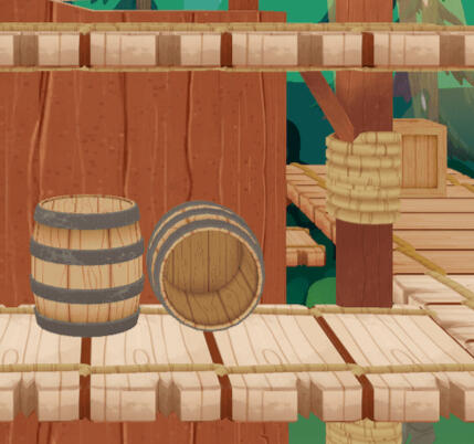
Low Poly Game Art
Example assets created for a cartoony tank combat game. The game featured themed accessories that you could add to your tank:


A selection of clothing and tool designs for a desert island survival game:


Assets created for a fantasy archery game. It began as a fully 2D game, then became a mix of 2D and 3D assets:


UI Designs
Custom UI for an idle factory themed mobile game:


Custom UI designs for casual mobile mini-games:


Custom UI for the level select screen of a delivery-themed mobile game:

Game Designs
Assets, mockups, and storyboards for mobile game designs:


Concept and images for an original game idea:


3D Art
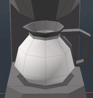
3D Pill Bottle
This was an attempt to create a totally photo-real asset using dynamic texturing. All text is editable, and label colors and wear level are dynamic:


Substance Designer Materials
All these materials were created in Substance Designer. All are fully procedural and made with inputs and controls for maximum flexibility:


Misc. Others


SimpleDoc is a straightforward Markdown-to-PDF template system. It allows you to write in plain Markdown, configure everything in one YAML file, run a build script, and get a polished PDF. No LaTeX knowledge is required.
SimpleDoc Lite—Free and open source version (under an MIT license) with enough features for casual use.
SimpleDoc Pro—Full featured version with more options for formatting and fine-tuning the output.
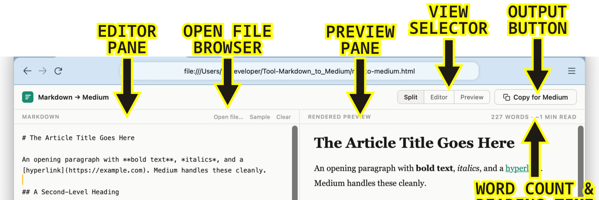
Markdown → Medium
Markdown → Medium is a simple tool for converting Markdown files to a format that can be pasted directly into the Medium.com editor, requiring only minimal formatting changes there. It opens as a web page in a browser, but does not require an internet connection to function. It is available for free download and use (under an MIT license) on my GitHub.
The "Why"
Moving Markdown text into Medium can be a tedious process. Medium uses a bespoke What You See Is What You Get (WYSIWYG) editor that doesn’t translate Markdown syntax. After manually reformatting my first Medium posts, I knew there had to be a better way. I couldn't find anything that did what I was after, so I decided to make it myself.
The "What"
The Markdown → Medium tool consists of three files:
md-to-medium.html—Holds the UI and core functionality.
marked.min.js—A JavaScript library that handles Markdown syntax.
purify.min.js—A JavaScript library that sanitizes inputs.
To use the tool, open the HTML file in a web browser. This will open a split view editor. Simply paste your Markdown formatted text in the left "editor" pane. The right pane will show the text as it will render in the Medium editor.
Medium's editor does not support all Markdown syntax. The Preview pane will mark changed elements with inline Warning Badges and Warning Flags in the bottom bar that show all changes.
Clicking the Copy to Medium button copies the translated text to the clipboard. Simply paste it into the Medium editor. All supported formatting is transferred (Warning Badges are not). For full details about limitations and supported elements, see the README file in the GitHub repository.

The "How"
I created this tool with the assistance of an LLM. The concept and functionality are my own. It took many iterations and a lot of testing to get it where it is now. I use it every week for my own writing, and will make updates as needed.
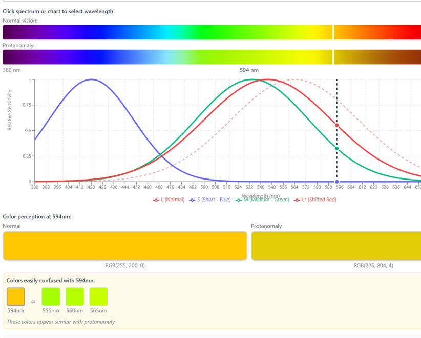
Spectral Sensitivity Chart
This is an interactive spectral sensitivity chart I designed and built as an educational tool—one that explains the mechanism behind color blindness, not just simulates its effects.
Problem
About 8% of men and 0.5% of women in the US have some form of color blindness—roughly 1 in 12 men and 1 in 200 women, with similar rates worldwide. Many tools simulate the effects of color vision differences, but none that I could find explain the mechanism behind them. Why, for instance, does red-green color blindness (protanomaly) make it difficult to distinguish certain blues and purples?
The answer is that in protanomaly, red cone sensitivity isn't reduced—it's shifted toward the short-wavelength end of the spectrum. I had trouble picturing what that actually meant for color perception, and couldn't find an accurate, interactive chart to explore it. So I made one.
Approach
I decided to build on the standard spectral sensitivity chart format—like the one on this page—which maps short to long wavelengths left to right, with three curves, one per cone type. I wanted it to update interactively to show different types of color vision deficiency.
I also wanted the ability to pick a spot on the spectrum and see, side by side, what a person with full color vision and a color-blind person would see. The hardest part was rendering the spectrum accurately—most existing tools use rough approximations, and this needed to be better than that.
Result
The result is the most useful tool I've found for exploring the mechanics of color blindness—and I think it can serve two audiences: product developers designing for accessibility, and people who want to understand their own vision.
This was built with AI-assisted development tools—design-led, with the prototype used to validate the approach.
Next Steps
Before publishing this permanently, I want to have the methods reviewed by a vision scientist. This is intended as a scientific tool, and it should meet that standard before it goes live.
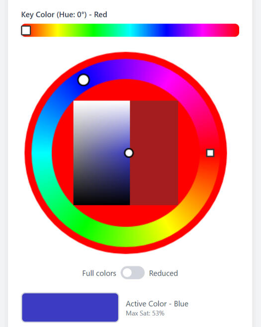
Harmony Color Picker
The Harmony Color Picker is a browser-based design tool I conceived, specced, and built as a working prototype. It automates a color-harmony technique I'd been applying manually for years.
Problem
There are many methods for creating harmonious color schemes. Among the simplest is to choose a key color for the composition and reduce the saturation of colors as they move away from it on the color wheel. It gets you most of the way to a cohesive scheme in one step. I looked for a tool that would automate this, but didn't find anything that did quite what I wanted. So I decided to make it myself.
Approach
What I wanted was a simple color picker that would automate that process—the current color locked within the limits set by the key color, a full palette with each color at its maximum saturation, all generated in one step. The tool outputs both HEX and HSL values, covering both design-tool workflows and web/CSS implementation.
The UI runs top to bottom, starting with key color selection and ending with the full scheme. The saturation effect is adjustable. Clicking any swatch copies its HEX code; a single button exports the full scheme as a text file.
Result
I've used this in my own work extensively. It does everything I designed it to do—and the process surfaced a few features I hadn't originally planned. The tool also includes a color-blindness preview and toggles for web-safe and print-safe output. These weren't in the original spec—they came out of using it. That's the version I'd take into a production build.
This version was built with AI-assisted development tools—the design spec came first, and the prototype proved it out.
Next Steps
The roadmap is a production web app, with a mobile version to follow—built with a development partner and engineered to the same standard as the design.
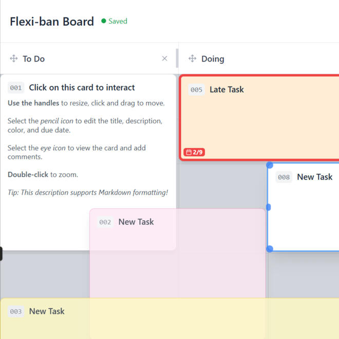
Flexible Kanban Board
This is a flexible Kanban board I designed and built as a proof of concept—rethinking what a digital task board could be if it weren't constrained by its physical origins.
Problem
Most software Kanban boards are too rigid—no matter how many features are layered on, they're still imitating a physical corkboard, not taking advantage of what digital actually makes possible.
Approach
I wanted to know what a board could do if the physical constraints were discarded. If cards could be resized at will and nested inside other cards, what possibilities would that open up? And what is the minimum a board needs to actually be useful? A basic grid kept it from collapsing into chaos—flexible enough to support a wide range of setups, structured enough to stay usable.
Result
Even at this stage, it's very close to the tool I had imagined—and moving, nesting, and rearranging cards turned out to be more intuitive than I expected. Overlapping and nesting flexible cards meant that subtasks and swimlanes emerged naturally, without dedicated features. Due dates, color coding, and commenting round out a minimal but genuinely useful feature set.
This was built with AI-assisted development tools—design-led, with the prototype used to validate the concept.
Next Steps
This proof of concept hasn't had enough testing time to say it's all worked out—the concept works, and now it needs a proper refinement pass. The UI already has known friction points: two separate interaction icons for viewing and editing is one example. A development partner would help surface the rest and build it out to the same standard.
COAM Regulation Docs
Georgia COAM (ClassB) Primer
A plain-English description of current Georgia COAM (Coin Operated Amusement Machine) regulations as of February 2026 (Sections 01 & 02), with guidance and insight into this unique market (Section 03), and links to important regulatory documents (Section 04).
Georgia COAM SAS Requirements
This document is designed for experienced slot developers and producers who need to quickly familiarize themselves with Georgia COAM regulations and requirements. It provides comprehensive lists of mandatory SAS events, extended polls, and meters, along with the restrictions imposed on secondary SAS connections.
Toki Pona Primer
Toki Pona is a minimalist constructed language with ~120–140 words and simple grammar. Its name means roughly "good language" or "simple language." It is intended to be fun to speak and flexible—designed to foster positive thoughts and interactions.
This unofficial guide covers grammar, key phrases, the full word list, and how to convert English names. It is intended to be a helpful guide for beginners and a useful reference for speakers at all levels. It is not a substitute for a structured course or textbook—no exercises, lessons, or guided progression are included.
To learn more, visit the official Toki Pona website.